Before you dive into all of our tutorials and walkthroughs for custom form building, we want to explain the editor tools and their function.
Video Tutorial:
00:00: Hi, this is Nikki from healthy roster. And this tutorial is going to give you a better understanding of the form Builder editor tools and their functionality behind them.
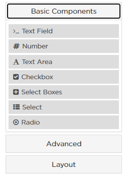
00:09: Let's review a text field. This is a single line text field element. The user will be able to type into the box the requested information.
00:19: Here you will see an example of a number component this produces a fillable box specifically for numbers.
00:27: Here you're viewing an example of a text area. This is a multiple line text field element. The user will be able to type into this box the requested information within multiple lines.
00:39: This text area is able to be edited to increase or decrease area available to be typed in select the setting icon to edit.
00:48: Here you will see the rows for this text area are set to 3 if the user types in more information than three lines allows it will not show on the end users forum. Increase or decrease this number as appropriate and select save to save this field edit.
01:04: Now, let's review a checkbox a checkbox sits under the common form components. This will produce a binary check. a good example for this format would be if you'd like someone to attest to a reading something check this box if you can send
01:19: Select box allows you the option to add multiple checkboxes at one time.
01:25: Inserting a select option will produce a drop-down selection option where you're able to input the specific options you'd like to add.
01:33: Option in the comments section is going to be to insert a radio component a radio will produce a binary choice between predetermined options.
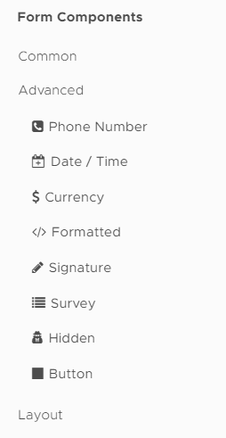
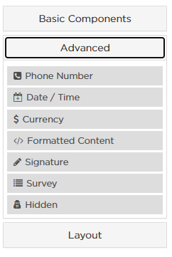
01:42: Now for the advanced components first, we have a phone number. This produces a fillable box with the input mask, which is preferred phone number design already predetermined.
01:54: Now let's review the date and time component dragging and dropping the date and time will automatically produce a calendar and a clock you can edit these to either enable or disable one or the other.
02:06: If you'd like to enable or disable one or the other select the settings icon.
02:11: Here if you navigate to date you can see that the checkbox is enabled for date input to disable uncheck this box repeat the step for time as well. If necessary, you can have date and time enabled or just date or just time that is up to your discretion.
02:28: Next you're able to drag and drop currency. This will produce a billable box for currency input. The format of that current seat is editable.
02:37: Next we have formatted content or HTML. This is the area where you can input content for semantics or meaning. If you have large bodies of text that need to be input on your form you will use formatted content.
02:51: Next we have the signature component dragging and dropping produces a signature item on the fillable form for your end user.
02:59: Next we have the survey component this produces a questionnaire in the format of question and answer with predetermined options.
03:08: Next we have a hidden item hidden items are typically used for survey response protocols. They are not to be seen by the end user but necessary for triggering a response protocol.
03:20: Next we have button. This is intended if you've accidentally removed your submit button. Dragging and dropping the button item will give you a new submit button.
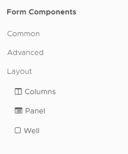
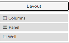
03:31: Next let's review the layout components. These layout options will create content area that you can build within to organize our cluster your data first. We have columns. This will produce blank formattable columns. You can edit by adding columns or removing them as necessary.
03:50: Next we have a panel item. These will produce a shadow box within the outline and they have a header. I specifically have used these panel items to group common Advanced and layout components into their own groups.
04:06: And lastly we have a well this will produce a shadow box without an outline and it does not have a header.
04:14: If you have questions or need more help, please visit the help tab on the left navigation or reach us directly at help at healthy roster.com.
Step-By-Step:
Basic Components
Text Field: A single-line text field element. The user will be able to type into this box the requested information
Number: Produces a fillable box for numbers
Text Area: A multiple-line text field element. The user will be able to type into this box the requested information on multiple lines
Checkbox: Produces a binary choice between two predefined options
Select Boxes: Allows you to add multiple checkboxes at one time
Select: Produces a drop down selection option
Radio: Produces a binary choice between two predefined options
Advanced Components
Phone Number: Produces a fillable box with the input mask (preferred phone number design) already predetermined
Date/Time: Produces a box that can host a Date, Time, or both
Currency: Produces a fillable box for currency input, format of currency is editable
</> Formatted Content: Content area for semantics or meaning
Signature: Produces ability to have an electronic signature
Survey: Produces a questionnaire in the format of: question and answer with predetermined options
Hidden: A tool that is not to be seen by the user completing the survey. Therefore it is 'hidden" from view
Button: Used to reinsert the submit button
Layout Options: These options will create a content area that you can build within to organize/cluster your data
Columns: Produces blank formattable columns
Panel: Produces a shadow box with an outline and has a header
Well: Produces a shadow box without an outline and does not have a header
Overview of Editor Tools for Custom Forms
Before you dive into all of our tutorials and walkthroughs for custom form building, we want to explain the editor tools and their function.
Basic Components
Text Field: A single-line text field element. The user will be able to type into this box the requested information
Number: Produces a fillable box for numbers
Text Area: A multiple-line text field element. The user will be able to type into this box the requested information on multiple lines
Checkbox: Produces a binary choice between two predefined options
Select Boxes: Allows you to add multiple checkboxes at one time
Select: Produces a drop down selection option
Radio: Produces a binary choice between two predefined options
Advanced Components
Phone Number: Produces a fillable box with the input mask (preferred phone number design) already predetermined
Date/Time: Produces a box that can host a Date, Time, or both
Currency: Produces a fillable box for currency input, format of currency is editable
</> Formatted Content: Content area for semantics or meaning
Signature: Produces ability to have an electronic signature
Survey: Produces a questionnaire in the format of: question and answer with predetermined options
Hidden: A tool that is not to be seen by the user competing the survey. Therefore it is 'hidden" from view
Layout Options: These options will create a content area that you can build within to organize/cluster your data
Columns: Produces blank formattable columns
Panel: Produces a shadow box with an outline and has a header
Well: Produces a shadow box without an outline and does not have a header
 Updated
by
Niki Budd
Updated
by
Niki Budd
